• Home
  • Guideline
  • Implementation
    • The Project
    • The Project Team
    • Advisory Board
  • Educational material
  • Publications
  • Contact
  • enEnglish
    • deDeutsch

Using graphics

Home Guideline Using graphics

Introduction

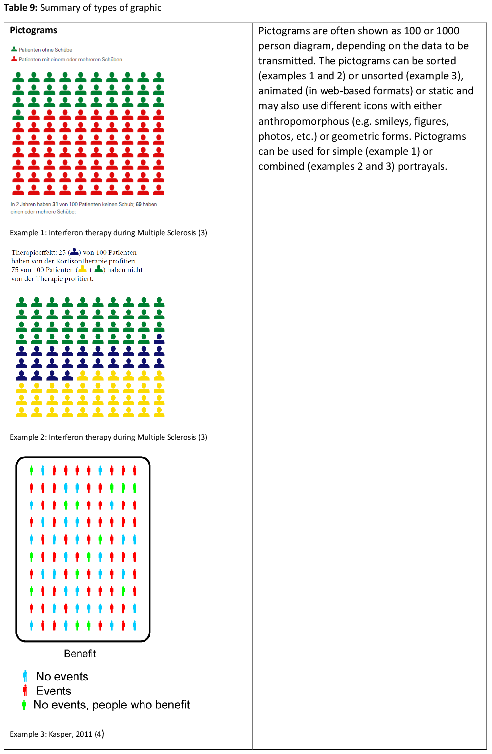
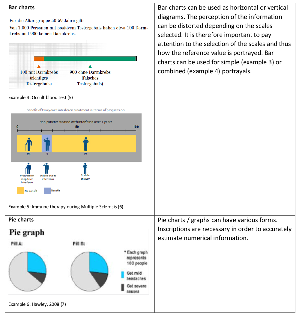
If data with a quantative statement are underlined visually, the viewer finds it easier to understand the contents. Graphic illustrations may help providing the numerical presentation with a meaningful supplement. However, graphics should be presented in a way that is easy to understand (1, 2), making a realistic assessment of risks, benefits and harm of preventive, diagnostic and therapeutic measures possible. Detailed graphics, comprehensive legends and suitable scale inscriptions enable a statement to be quickly understood (1). Nevertheless, graphics are not always interpreted in the way the data provider intends (1). Several fields of science, i.e. psychology, medicine, health sciences and market research, are investigating how the type of graphic used can lead to a better understanding of the intended statement. There are various types of graphic in use. Pictograms, bar charts and pie charts are used particularly for transmitting health information (cf. Table 9). For instance, pictograms can be deployed in many variations to provide simple, combined or animated presentations. Diagrams are portrayed mostly as bar or pie charts. The following explanations show the effects that visual enhancement of text statements can have on the reader.

Questions

  1. What effects do graphics in health information have when compared with text only?
  2. What effects do the various types of graphics have in comparison with each other?
  3. What effects do sorted or unsorted pictograms have in comparison with each other?
  4. What effects do animated or static pictograms have in comparison with each other?
  5. What effects do the different types of icons have in comparison with each other?
  6. What effects do simple risk presentation in graphics have in comparison with combined risk presentation?
Recommendation 1-6
Evidence tables 1-6
Full text
[ultimate_exp_section title=”References” new_title=”References” icon=”none” new_icon=”none”]
  1. Ancker JS, Senathirajah Y, Kukafka R, Starren JB. Design features of graphs in health risk communication: a systematic review. Journal of the American Medical Informatics Association. 2006;13(6):608-18. Epub 2006/08/25.
  2. Bunge M, Mühlhauser I, Steckelberg A. What constitutes evidence-based patient information? Overview of discussed criteria. [References]. Patient Education and Counseling. 2012;78(3):316-28.
  3. Heesen C, Köpke S, Kasper J. Immuntherapien der Multiplen Sklerose. 2008; http://www.gesundheit.uni-hamburg.de/upload/Immuntherapien%20der%20MS.pdf (Zugriff am 12.10.2016)
  4. Kasper J, Heesen C, Köpke S, Mühlhauser I, Lenz M. Why not? Communicating stochastic information by use of unsorted frequency pictograms-A randomised controlled trial. [References]. GMS Psycho-Social-Medicine. 2011;8:ArtID- Doc08.
  5. Steckelberg A, Mühlhauser I. Darmkrebs Screening. 2011; http://www.gesundheit.uni-hamburg.de/upload/NeueDarmkrebsbroschuere2011.pdf (Zugriff am 12.10.2016).
  6. Kasper J, Roemer Avd, Pöttgen J, Rahn A, Backhus I, Bay Y, et al. A new graphical format to communicate treatment effects to patients—A web-based randomized controlled trial. Health expectations: an international journal of public participation in health care and health policy. 2016. Epub ahead of print.
  7. Hawley ST, Zikmund-Fisher B, Ubel P, Jancovic A, Lucas T, Fagerlin A. The impact of the format of graphical presentation on health-related knowledge and treatment choices2008; http://onlinelibrary.wiley.com/o/cochrane/clcentral/articles/282/CN-00665282/ frame.html (Zugriff am 12.10.2016).
  8. Ruiz JG, Andrade AD, Garcia-Retamero R, Anam R, Rodriguez R, Sharit J. Communicating global cardiovascular risk: are icon arrays better than numerical estimates in improving understanding, recall and perception of risk? Patient Education and Counseling. 2013;93(3):394-402. Epub 2013/08/07.
  9. Sprague D, LaVallie DL, Wolf FM, Jacobsen C, Sayson K, Buchwald D. Influence of graphic format on comprehension of risk information among American Indians. [References]. Medical Decision Making. 2011;31(3):437-43.
  10. Brewer NT, Gilkey MB, Lillie SE, Hesse BW, Sheridan SL. Tables or bar graphs? Presenting test results in electronic medical records. Medical Decision Making. 2012;32(4):545-53. Epub 2012/04/05.
  11. Tait AR, Voepel-Lewis T, Zikmund-Fisher BJ, Fagerlin A. The effect of format on parents’ understanding of the risks and benefits of clinical research: a comparison between text, tables, and graphics. 2010; http://onlinelibrary.wiley.com/o/cochrane/clcentral/ articles/561/CN-00749561/frame.html (Zugriff am 12.10.2016).
  12. Tait AR, Voepel-Lewis T, Zikmund-Fisher BJ, Fagerlin A. Presenting research risks and benefits to parents: does format matter? 2010; http://onlinelibrary.wiley.com/o/cochrane/ clcentral/articles/178/CN-00760178/frame.html (Zugriff am 12.10.2016).
  13. Tait AR, Voepel-Lewis T, Brennan-Martinez C, McGonegal M, Levine R. Using animated computer-generated text and graphics to depict the risks and benefits of medical treatment. American Journal of Medicine. 2012;125(11):1103-10. Epub 2012/09/04.
  14. Lee DH, Mehta MD. Evaluation of a visual risk communication tool: effects on knowledge and perception of blood transfusion risk. Transfusion. 2003;43(6):779-87. Epub 2003/05/22.
  15. Zikmund-Fisher BJ, Ubel PA, Smith DM, Derry HA, McClure JB, Stark A, et al. Communicating side effect risks in a tamoxifen prophylaxis decision aid: the debiasing influence of pictographs. Patient Education and Counseling. 2008;73(2):209-14. Epub 2008/07/08.
  16. Ghosh K, Crawford BJ, Pruthi S, Williams CI, Neal L, Sandhu NP, et al. Frequency format diagram and probability chart for breast cancer risk communication: a prospective, randomized trial. 2008; http://onlinelibrary.wiley.com/o/cochrane/clcentral/articles/437/CN-00665437/frame.html (Zugriff am 12.10.2016).
  17. Feldman-Stewart D, Brundage MD, Zotov V. Further insight into the perception of quantitative information: judgments of gist in treatment decisions. Medical Decision Making. 2007;27(1):34-43. Epub 2007/01/24.
  18. Zikmund-Fisher BJ, Witteman HO, Fuhrel-Forbis A, Exe NL, Kahn VC, Dickson M. Animated graphics for comparing two risks: a cautionary tale. Journal of medical Internet research. 2012;14(4):e106. Epub 2012/07/27.
  19. Schapira MM, Nattinger AB, McAuliffe TL. The influence of graphic format on breast cancer risk communication. Journal of Health Communication. 2006;11(6):569-82. Epub 2006/09/05.
  20. Wright P. What if…? Designing tools to help the public make difficult decisions. [References]. Information Design Journal. 2009;17(3):202-10.
  21. Ancker JS, Weber EU, Kukafka R. Effects of game-like interactive graphics on risk perceptions and decisions. Medical decision making. 2011;31(1):130-42. Epub 2010/04/16.
  22. Zikmund-Fisher BJ, Dickson M, Witteman HO. Cool but counterproductive: interactive, Web-based risk communications can backfire. Journal of medical Internet research. 2011;13(3):e60. Epub 2011/08/27.
  23. Zikmund-Fisher BJ, Witteman HO, Dickson M, Fuhrel-Forbis A, Kahn VC, Exe NL, et al. Blocks, ovals, or people? Icon type affects risk perceptions and recall of pictographs. [References]. Medical Decision Making. 2014;34(4):443-53.
  24. Gaissmaier W, Wegwarth O, Skopec D, Muller AS, Broschinski S, Politi MC. Numbers can be worth a thousand pictures: individual differences in understanding graphical and numerical representations of health-related information. Health Psychology. 2012;31(3):286-96. Epub 2011/08/17.
  25. Price M, Cameron R, Butow P. Communicating risk information: the influence of graphical display format on quantitative information perception-Accuracy, comprehension and preferences. Patient Education and Counseling. 2007;69(1-3):121-8. Epub 2007/10/02.
  26. McCaffery KJ, Dixon A, Hayen A, Jansen J, Smith S, Simpson JM. The influence of graphic display format on the interpretations of quantitative risk information among adults with lower education and literacy: A randomized experimental study. [References]. Medical Decision Making. 2012;32(4):532-44.
  27. Zikmund-Fisher BJ, Fagerlin A, Ubel PA. Improving understanding of adjuvant therapy options by using simpler risk graphics. Cancer. 2008;113(12):3382-90. Epub 2008/11/18.
  28. Zikmund-Fisher BJ, Fagerlin A, Ubel PA. A demonstration of “less can be more” in risk graphics. [References]. Medical Decision Making. 2010;30(6):661-671.
[/ultimate_exp_section]

© 2014-2017 Leitlinie Gesundheitsinformation

  • Contact
  • Disclaimer & Privacy Policy
  • Imprint