• Startseite
  • Leitlinie
  • Implementierung
    • Das Projekt IMLEGI
    • Das Projektteam IMLEGI
    • Der Beirat IMLEGI
  • Schulungsmaterial
  • Publikationen
  • Kontakt
  • deDeutsch
    • enEnglish

Einsatz von Grafiken

Startseite Leitlinie Einsatz von Grafiken

Hintergrund

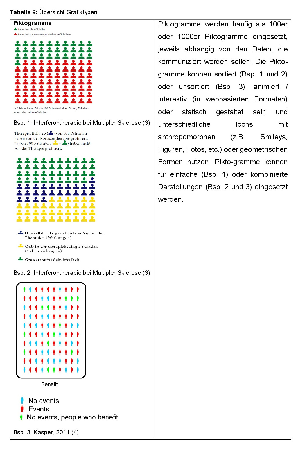
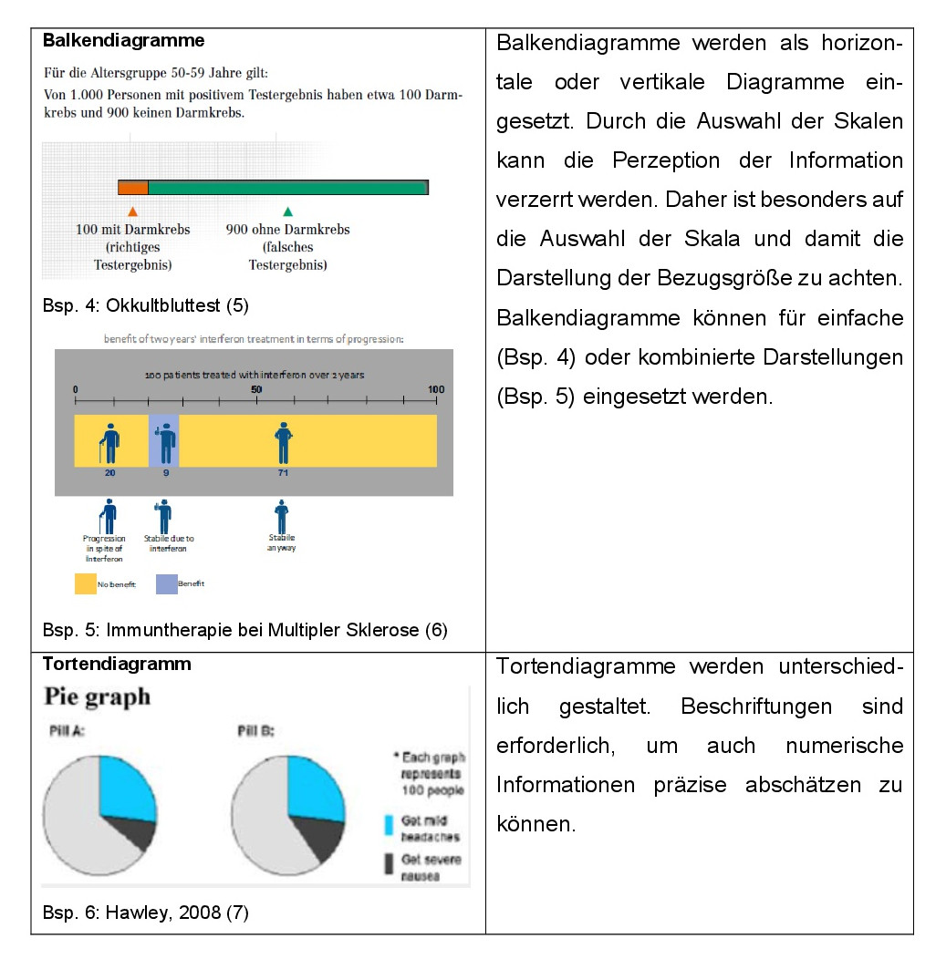
Werden Daten mit einer quantitativen Aussage visuell unterfüttert, können sie dem Betrachter das Verständnis der Inhalte erleichtern. Eine Möglichkeit dazu sind graphische Abbildungen. Sie sind eine sinnvolle Ergänzung zu numerischen Darstellungen. Grafiken sollten jedoch in einer leicht verständlichen Form präsentiert werden (1, 2). Die realistische Einschätzung von Risiken, Nutzen und Schaden präventiver, diagnostischer und therapeutischer Maßnahmen soll ermöglicht werden. Ausführlich gestaltete Grafiken mit einer vollständigen Legende und einer angemessenen Skalenbeschriftung können das schnellere Erfassen einer Aussage ermöglichen (1). Dennoch werden Grafiken nicht immer, wie vom Übermittler der Information erwartet, richtig interpretiert (1). Mehrere Wissenschaftsbereiche forschen, in wieweit die Art der Grafiken zu einem besseren Verständnis von Aussagen beitragen. So im Bereich der Psychologie, der Medizin, der Gesundheitswissenschaften und der Marktforschung. Es werden verschiedene Typen von Grafiken verwendet. Im Bereich der Gesundheitsinformationen werden insbesondere Piktogramme, Balkendiagramme und Tortendiagramme genutzt (vgl. Tabelle 9). So können beispielsweise die Piktogramme sehr variantenreich in einfachen, kombinierten, animierten oder auch interaktiven Darstellungen zum Einsatz kommen. Diagramme werden überwiegend als Balken- oder Tortendiagramme dargestellt. Welche Effekte solche visuellen Ergänzungen in den Textaussagen auf die Leser haben, zeigen die nachfolgenden Erläuterungen.

Fragestellungen

  1. Welche Effekte haben grafische Darstellungen in Gesundheitsinformationen im Vergleich zum Text allein?
  2. Welche Effekte haben die verschiedenen Grafiktypen im Vergleich miteinander?
  3. Welche Effekte haben sortierte vs. unsortierte Piktogramme im Vergleich?
  4. Welche Effekte haben animierte vs. statische Piktogramme im Vergleich?
  5. Welche Effekte haben die verschiedenen Icon-Typen in Piktogrammen im Vergleich?
  6. Welche Effekte haben einfache Risikodarstellungen im Vergleich zu kombinierten Risikodarstellungen in Grafiken?
Empfehlung 1-6
Evidenztabellen 1-6
Volltext
[ultimate_exp_section title=“Referenzen“ new_title=“Referenzen“ icon=“none“ new_icon=“none“]
  1. Ancker JS, Senathirajah Y, Kukafka R, Starren JB. Design features of graphs in health risk communication: a systematic review. Journal of the American Medical Informatics Association. 2006;13(6):608-18. Epub 2006/08/25.
  2. Bunge M, Mühlhauser I, Steckelberg A. What constitutes evidence-based patient information? Overview of discussed criteria. [References]. Patient Education and Counseling. 2012;78(3):316-28.
  3. Heesen C, Köpke S, Kasper J. Immuntherapien der Multiplen Sklerose. 2008; http://www.gesundheit.uni-hamburg.de/upload/Immuntherapien%20der%20MS.pdf (Zugriff am 12.10.2016)
  4. Kasper J, Heesen C, Köpke S, Mühlhauser I, Lenz M. Why not? Communicating stochastic information by use of unsorted frequency pictograms-A randomised controlled trial. [References]. GMS Psycho-Social-Medicine. 2011;8:ArtID- Doc08.
  5. Steckelberg A, Mühlhauser I. Darmkrebs Screening. 2011; http://www.gesundheit.uni-hamburg.de/upload/NeueDarmkrebsbroschuere2011.pdf (Zugriff am 12.10.2016).
  6. Kasper J, Roemer Avd, Pöttgen J, Rahn A, Backhus I, Bay Y, et al. A new graphical format to communicate treatment effects to patients—A web-based randomized controlled trial. Health expectations: an international journal of public participation in health care and health policy. 2016. Epub ahead of print.
  7. Hawley ST, Zikmund-Fisher B, Ubel P, Jancovic A, Lucas T, Fagerlin A. The impact of the format of graphical presentation on health-related knowledge and treatment choices2008; http://onlinelibrary.wiley.com/o/cochrane/clcentral/articles/282/CN-00665282/ frame.html (Zugriff am 12.10.2016).
  8. Ruiz JG, Andrade AD, Garcia-Retamero R, Anam R, Rodriguez R, Sharit J. Communicating global cardiovascular risk: are icon arrays better than numerical estimates in improving understanding, recall and perception of risk? Patient Education and Counseling. 2013;93(3):394-402. Epub 2013/08/07.
  9. Sprague D, LaVallie DL, Wolf FM, Jacobsen C, Sayson K, Buchwald D. Influence of graphic format on comprehension of risk information among American Indians. [References]. Medical Decision Making. 2011;31(3):437-43.
  10. Brewer NT, Gilkey MB, Lillie SE, Hesse BW, Sheridan SL. Tables or bar graphs? Presenting test results in electronic medical records. Medical Decision Making. 2012;32(4):545-53. Epub 2012/04/05.
  11. Tait AR, Voepel-Lewis T, Zikmund-Fisher BJ, Fagerlin A. The effect of format on parents‘ understanding of the risks and benefits of clinical research: a comparison between text, tables, and graphics. 2010; http://onlinelibrary.wiley.com/o/cochrane/clcentral/ articles/561/CN-00749561/frame.html (Zugriff am 12.10.2016).
  12. Tait AR, Voepel-Lewis T, Zikmund-Fisher BJ, Fagerlin A. Presenting research risks and benefits to parents: does format matter? 2010; http://onlinelibrary.wiley.com/o/cochrane/ clcentral/articles/178/CN-00760178/frame.html (Zugriff am 12.10.2016).
  13. Tait AR, Voepel-Lewis T, Brennan-Martinez C, McGonegal M, Levine R. Using animated computer-generated text and graphics to depict the risks and benefits of medical treatment. American Journal of Medicine. 2012;125(11):1103-10. Epub 2012/09/04.
  14. Lee DH, Mehta MD. Evaluation of a visual risk communication tool: effects on knowledge and perception of blood transfusion risk. Transfusion. 2003;43(6):779-87. Epub 2003/05/22.
  15. Zikmund-Fisher BJ, Ubel PA, Smith DM, Derry HA, McClure JB, Stark A, et al. Communicating side effect risks in a tamoxifen prophylaxis decision aid: the debiasing influence of pictographs. Patient Education and Counseling. 2008;73(2):209-14. Epub 2008/07/08.
  16. Ghosh K, Crawford BJ, Pruthi S, Williams CI, Neal L, Sandhu NP, et al. Frequency format diagram and probability chart for breast cancer risk communication: a prospective, randomized trial. 2008; http://onlinelibrary.wiley.com/o/cochrane/clcentral/articles/437/CN-00665437/frame.html (Zugriff am 12.10.2016).
  17. Feldman-Stewart D, Brundage MD, Zotov V. Further insight into the perception of quantitative information: judgments of gist in treatment decisions. Medical Decision Making. 2007;27(1):34-43. Epub 2007/01/24.
  18. Zikmund-Fisher BJ, Witteman HO, Fuhrel-Forbis A, Exe NL, Kahn VC, Dickson M. Animated graphics for comparing two risks: a cautionary tale. Journal of medical Internet research. 2012;14(4):e106. Epub 2012/07/27.
  19. Schapira MM, Nattinger AB, McAuliffe TL. The influence of graphic format on breast cancer risk communication. Journal of Health Communication. 2006;11(6):569-82. Epub 2006/09/05.
  20. Wright P. What if…? Designing tools to help the public make difficult decisions. [References]. Information Design Journal. 2009;17(3):202-10.
  21. Ancker JS, Weber EU, Kukafka R. Effects of game-like interactive graphics on risk perceptions and decisions. Medical decision making. 2011;31(1):130-42. Epub 2010/04/16.
  22. Zikmund-Fisher BJ, Dickson M, Witteman HO. Cool but counterproductive: interactive, Web-based risk communications can backfire. Journal of medical Internet research. 2011;13(3):e60. Epub 2011/08/27.
  23. Zikmund-Fisher BJ, Witteman HO, Dickson M, Fuhrel-Forbis A, Kahn VC, Exe NL, et al. Blocks, ovals, or people? Icon type affects risk perceptions and recall of pictographs. [References]. Medical Decision Making. 2014;34(4):443-53.
  24. Gaissmaier W, Wegwarth O, Skopec D, Muller AS, Broschinski S, Politi MC. Numbers can be worth a thousand pictures: individual differences in understanding graphical and numerical representations of health-related information. Health Psychology. 2012;31(3):286-96. Epub 2011/08/17.
  25. Price M, Cameron R, Butow P. Communicating risk information: the influence of graphical display format on quantitative information perception-Accuracy, comprehension and preferences. Patient Education and Counseling. 2007;69(1-3):121-8. Epub 2007/10/02.
  26. McCaffery KJ, Dixon A, Hayen A, Jansen J, Smith S, Simpson JM. The influence of graphic display format on the interpretations of quantitative risk information among adults with lower education and literacy: A randomized experimental study. [References]. Medical Decision Making. 2012;32(4):532-44.
  27. Zikmund-Fisher BJ, Fagerlin A, Ubel PA. Improving understanding of adjuvant therapy options by using simpler risk graphics. Cancer. 2008;113(12):3382-90. Epub 2008/11/18.
  28. Zikmund-Fisher BJ, Fagerlin A, Ubel PA. A demonstration of „less can be more“ in risk graphics. [References]. Medical Decision Making. 2010;30(6):661-671.
[/ultimate_exp_section]

© 2014-2017 Leitlinie Gesundheitsinformation

  • Kontakt
  • Disclaimer & Datenschutzerklärung
  • Impressum